
By Bob Rudis (@hrbrmstr)
Mon 15 December 2014
|
tags:
blog,
vis,
excel,
pie,
bar,
bar chart,
chart,
dashboard,
-- (permalink)
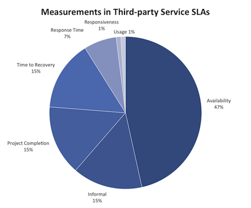
As I was cruising through the RSS feeds this morning, I came across this post by Daniel Kennedy on the 451 Research blog that included this chart:

Now, 451 is my personal favorite industry research firm both as a data dude and as a former F100 executive. They’ve got some of the smartest SMEs and are one of the best data-driven analyst firms out there. Even just looking at this chart, all of the “chart junk” has been removed and they applied a decent color scheme (which aligns to their logo colors). But, even as pie charts go, it needs some help.
We here at DDSEC tend to spew out a fair chunk of R code in our posts, and I realize that R is not exactly a first-class citizen on the desktops of most security practicioners (which is one reason we only used Excel in the “dashboards” chapter of our book), so let’s give this chart a makeover only using Excel.
Pies are never my go-to chart for anything, but the only thing really wrong with this pie (besides the fact that it is a pie) is the lack of starting at noon. So, let’s fix that first:
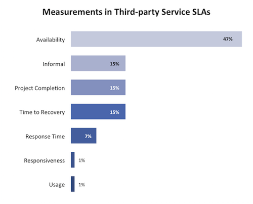
and we can stop there (it’s nigh perfect insofar as pie charts are concerned). Having said that, I think this data is just begging for bar chart:
Rather than post a screen-cast or series of step-by-step screen shots, I’ve provided an Excel file that has data tables and corresponding charts you can just use or explore/modify.
As an aside, the verbose R ggplot method (which I could not resist including below) of making a similar chart is really nothing more than using individal text statements/directives to set the same graph configuration options you’re using a mouse to do in Excel (with the added benefit of being able to run 100 charts through the same code without wearing out your mouse battery or left-click button).
library(ggplot2)
library(scales)

dat <- data.frame(measure=c("Availability", "Time to\nRecovery", "Project\nCompletion",
                            "Informal", "Response\nTime", "Usage", "Responsiveness"),
                  value=c(0.47, 0.15, 0.15, 0.15, 0.07, 0.01, 0.01),
                  inout=c(1.15, 1.15, 1.15, 1.15, 1.15, -0.15, -0.15),
                  lab=c("black", "black", "white", "white", "white", "black", "black"),
                  col=c("#d0d1e6", "#a6bddb", "#74a9cf", "#3690c0", "#0570b0",
                        "#045a8d", "#023858"))

gg <- ggplot(dat, aes(x=reorder(measure, value), y=value))
gg <- gg + geom_bar(stat="identity", aes(fill=col), width=0.45)
gg <- gg + geom_text(aes(label=percent(value), hjust=inout, color=lab), size=5)
gg <- gg + coord_flip()
gg <- gg + scale_color_identity()
gg <- gg + scale_fill_identity()
gg <- gg + scale_y_continuous(expand=c(0,0))
gg <- gg + labs(x=NULL, y="% of network managers interviewed",
                title="Measurements in Third-party Service SLAs")
gg <- gg + theme_bw()
gg <- gg + theme(legend.position="none")
gg <- gg + theme(panel.grid=element_blank())
gg <- gg + theme(panel.border=element_blank())
gg <- gg + theme(axis.ticks.x=element_blank())
gg <- gg + theme(axis.text=element_text(size=14))
gg <- gg + theme(axis.text.x=element_blank())
gg <- gg + theme(axis.ticks.y=element_blank())
gg <- gg + theme(axis.title.y=element_text(size=12, face="plain"))
gg <- gg + theme(plot.title=element_text(size=16, face="bold"))
gg