
By Bob Rudis (@hrbrmstr)
Tue 19 May 2015
|
tags:
blog,
-- (permalink)
Akamai released it’s Q1 State of the Internet/Security Report today. They were an awesome partner for this and previous year’s DBIRs and their report (along with Arbor Networks Report) provides a much more detailed look at denial of service attacks than we could ever have done in ours. They’ve also fully incporporated the data from Prolexic (a fairly recent Akamai acquisition) so it’s also more comprehensive than ever.
After going through the pages I became obsessed with Figure 1-4:
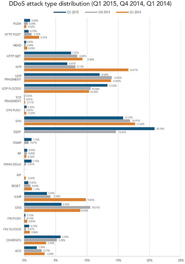
There’s nothing technically wrong with this chart. If I have to use grouped bars, I try to limit the categories to three (which Akamai did) and the overall aesthetics are fine. But, I think it’s hard to pick out a story from it, and I thought there were possibly stories one could tell just from the chart alone. So, I fired up RStudio and had a go at it.
Beating Bars Into Line-shares
Given that Akamai is looking at categorical value changes over time, my mind went immediately to using a bumps chart (AKA parallel coordiantes chart). And, since Akamai broke down DDoS attacks into Infrastructure and Application categories in their Figure 1-3 (page 11), it also seemed to make sense to do the same for this one. First, we need the data, and you can find the data & code in this gist.
To use the “wide” CSV file, we need to read it in and transform it, converting some values along the way to make them easier to graph later on:
library(readr)
library(tidyr)
library(dplyr)
library(ggplot2)
library(scales)
library(gridExtra)

read_csv("ddos-akamai.csv") %>%
  gather(quarter, value, -layer, -Vector) %>%
  mutate(quarter=as.Date(quarter, format="%m/%d/%Y"),
         value=ifelse(is.na(value), 0, value)) %>%
  mutate(value=value/100) -> dat

# this will help us make vertical lines later
qtr <- data.frame(d=unique(dat$quarter))
We’ll build two ggplot objects, one for the Infrastructure bits and one for the Application ones. It’s the same basic approach for both (comments inline):
# separate out infra and plot it

dat %>% filter(layer=="Infrastructure") -> infra

# this helps us order the legend by the last quarterly value
infra %>% filter(quarter==qtr$d[3]) %>% arrange(desc(value)) %>% .$Vector -> infra_vec
infra %>% mutate(Vector=factor(Vector, levels=infra_vec, ordered=TRUE)) -> infra

gg <- ggplot(infra, aes(x=quarter, y=value, group=Vector))
# vertical dashed lines for the quarters
gg <- gg + geom_vline(data=qtr, aes(xintercept=as.numeric(d)),
                      linetype="dashed", color="#7f7f7f", alpha=3/4
# this draws the actual lines
gg <- gg + geom_line(aes(color=Vector), size=1/3, alpha=3/4)
# remove spacing on x axis and format our labels
gg <- gg + scale_x_date(expand=c(0, 0), label=date_format("%Y-%b"))
# format the labels on the y axis too
gg <- gg + scale_y_continuous(label=percent)
# rename the legend
gg <- gg + scale_color_discrete(name="Infra\nVector")
gg <- gg + labs(x=NULL, y="DDoS Attack Vector Frequency",
                title="DDoS attack type distribution (Infrastructure)\n")
gg <- gg + theme_bw()
# remove some chart junk
gg <- gg + theme(panel.border=element_blank())
gg <- gg + theme(panel.grid=element_blank())
gg <- gg + theme(axis.ticks.x=element_blank())
gg <- gg + theme(axis.ticks.y=element_blank())
# left justify and make the titles a bit bolder
gg <- gg + theme(plot.title=element_text(hjust=0, size=14, face="bold"))
infra_gg <- gg

# do apps now

dat %>% filter(layer!="Infrastructure") -> app
app %>% filter(quarter==qtr$d[3]) %>% arrange(desc(value)) %>% .$Vector -> app_vec
app %>% mutate(Vector=factor(Vector, levels=app_vec, ordered=TRUE)) -> app

gg <- ggplot(app, aes(x=quarter, y=value, group=Vector))
gg <- gg + geom_vline(data=qtr, aes(xintercept=as.numeric(d)),
                      linetype="dashed", color="#7f7f7f", alpha=3/4)
gg <- gg + geom_line(aes(color=Vector), size=1/3, alpha=3/4)
gg <- gg + scale_x_date(expand=c(0, 0), label=date_format("%Y-%b"))
gg <- gg + scale_y_continuous(label=percent, breaks=c(0.0, 0.05, 0.10), limits=c(0.0, 0.1))
gg <- gg + scale_color_discrete(name="App\nVector")
gg <- gg + labs(x=NULL, y="DDoS Attack Vector Frequency",
                title="DDoS attack type distribution (Application)\n")
gg <- gg + theme_bw()
gg <- gg + theme(panel.border=element_blank())
gg <- gg + theme(panel.grid=element_blank())
gg <- gg + theme(axis.ticks.x=element_blank())
gg <- gg + theme(axis.ticks.y=element_blank())
gg <- gg + theme(plot.title=element_text(hjust=0, size=14, face="bold"))
gg <- gg + theme(legend.key=element_rect())
app_gg <- gg
If you were to go ahead and look at each plot separately (or together) you’d see that they don’t line up well because the legend widths don’t match.
We can take care of that by pre-generating the grid “Grobs” and stealing the width information from the larger plot:
infra_grob <- ggplotGrob(infra_gg)
app_grob <- ggplotGrob(app_gg)
app_grob$widths <- infra_grob$widths
Then, it’s just a matter of arranging them with appropriate spacing.
grid.arrange(infra_grob, app_grob, ncol=1, heights=c(0.75, 0.25))
The initial result is below:
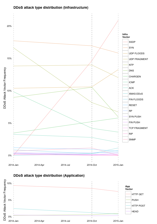
That’s good, but we can do better if we take the chart and tweak it a bit in OmniGraffle (or Inkscape, or Illustrator or…). We can remove the need for a color legend map by putting the appropriate vector labels right next to the chart. Plus, we can highlight any of the ones that should be highlighted (i.e. if there’s a story in them). I just emphasized three of the ones that had a “rising” effect, but there may be a story in the DNS vector that should have caused it to be highlighted. We can also remove some y-axis labeling duplication.
My “final” version is below (and it’s an SVG, so if you’re browser-challenged, either upgrade or drop a note in the comments and I’ll gen a PNG):

I have “final” in quotes as I could have spent a bit more time on it (it needs some final tweaks), but actual work beckons.
Fin
Remember, visualizations can and should tell a story in their own right. Take a listen to Episode 16 of our podcast if you want to hear a visualization expert critique the 2015 DBIR and provide suggestions for how we could have communicated better with our own graphs.
And, a huge “thank you” to Akamai for taking the time and resources to produce their report!
Tweet