By Bob Rudis (@hrbrmstr)
Thu 02 July 2015
|
tags:
blog,
r,
rstats,
survey,
vis,
datavis,
-- (permalink)
It seems that not a day goes by without some information security vendor releasing a report based on a survey. Thankfully, this post is not about the efficacy of survey-based reports or their findings. Today, we’re doing a makeover for Unisys, who just released their Findings from the 2015 Unisys Security Insights Survey.
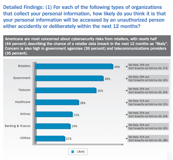
I started reading their U.S. findings [PDF] and—after reading their “Polling Methodology” section (you do look for the methodology section first before trying to decide to even bother with the rest of a report, right?)—I started paging back up to the top when I was greeted with this:

(you can see it on page 5 of the U.S. report)
The goal of the chart seems to be to show which industry Americans believe will suffer a data breach involving their records. There are two, quickly obvious initial issues:
- 3D-ish bars
- a singular-element legend (which is completely redundant)
Merely fixing those problems is, however, not enough. So, we won’t be showing an intermediate step (you can just picture a flat bar chart with no legend).
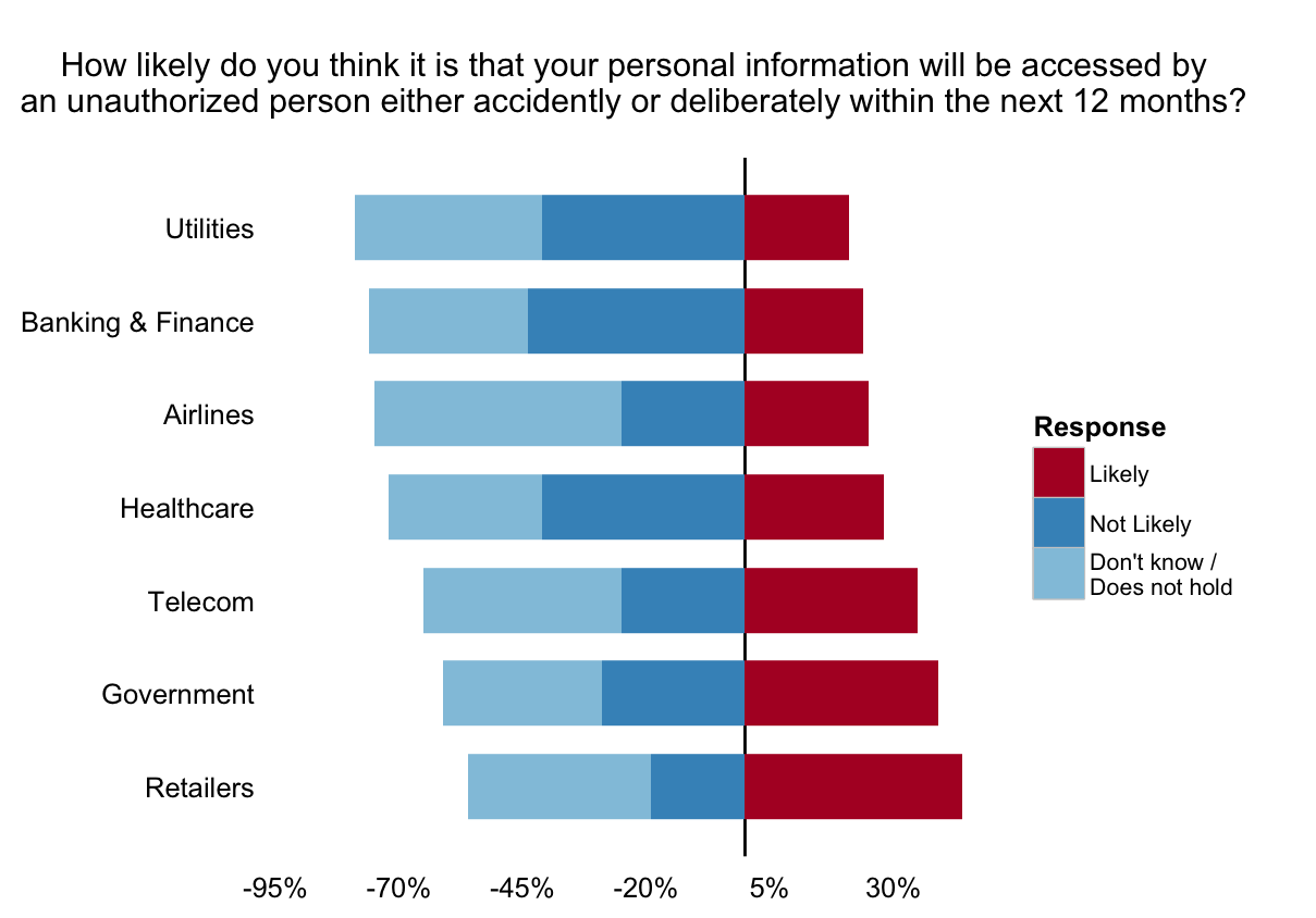
Since this is a survey, the folks at the Liberman Research Group (Unisys used them for the poll/repot) used what appears to be a 3-point Likert scale (which is fine) to gauge the responses. The other two values (besides “Likely”) are “Not Llikely” and “Don’t know/Do not hold my data”. The values for those categories are in chart text annotations, making it nigh impossible to compare those two values across industries, which could easily add further insight. Adding these values to the visualization won’t take up any more page real estate, so why not show all the values and let readers do a broader comparison?
Makeover
We’ll use ggplot2 in R to re-design the chart and incorporate all the answer levels. First, we need some libraries and the data:
library(dplyr)
library(tidyr)
library(ggplot2)
library(scales)

unisys_breach_likelihood <- read.table(text="Industry,likely,not_likely,dont_know_or_hold
Retailers,.44,.19,.37
Government,.39,.29,.32
Telecom,.35,.25,.40
Healthcare,.28,.41,.31
Airlines,.25,.25,.50
Banking & Finance,.24,.44,.32
Utilities,.21,.41,.38", sep=",", header=TRUE, stringsAsFactors=FALSE)
Next, we need to reshape that into something we can work with in ggplot, which is pretty straightforward with tidyr:
unisys_breach_likelihood %>%
  gather(Response, percent, -Industry) -> lik
That takes the three response columns and collapses them into one (wide-to-long, as it were). So, it goes from:
           Industry likely not_likely dont_know_or_hold
1         Retailers   0.44       0.19              0.37
2        Government   0.39       0.29              0.32
3           Telecom   0.35       0.25              0.40
4        Healthcare   0.28       0.41              0.31
5          Airlines   0.25       0.25              0.50
6 Banking & Finance   0.24       0.44              0.32
7         Utilities   0.21       0.41              0.38
to:
           Industry          Response percent
1          Retailers            likely    0.44
2         Government            likely    0.39
3            Telecom            likely    0.35
4         Healthcare            likely    0.28
5           Airlines            likely    0.25
6  Banking & Finance            likely    0.24
7          Utilities            likely    0.21
8          Retailers        not_likely    0.19
9         Government        not_likely    0.29
10           Telecom        not_likely    0.25
11        Healthcare        not_likely    0.41
12          Airlines        not_likely    0.25
13 Banking & Finance        not_likely    0.44
14         Utilities        not_likely    0.41
15         Retailers dont_know_or_hold    0.37
16        Government dont_know_or_hold    0.32
17           Telecom dont_know_or_hold    0.40
18        Healthcare dont_know_or_hold    0.31
19          Airlines dont_know_or_hold    0.50
20 Banking & Finance dont_know_or_hold    0.32
21         Utilities dont_know_or_hold    0.38
The bar ordering in the original chart was good, so lets ensure ggplot will also order the Industries properly:
lik %>%
  filter(Response=="likely") %>%
  arrange(desc(percent)) %>%
  .$Industry -> ind_order
(We’ll use ind_order in a bit.)
We also want the responses ordered properly for the correct “Likert order” for interpreation, so we tackle that next and also give ggplot a way to make nicer legend labels from the column/response names:
lik %>%
  mutate(Industry=factor(Industry, levels=ind_order, ordered=TRUE)) %>%
  mutate(Response=factor(Response,
                         levels=c("likely", "not_likely", "dont_know_or_hold"),
                         ordered=TRUE,
                         labels=c("Likely", "Not Likely",
                                  "Don't know / \nDoes not hold"))) %>%
  mutate(percent=ifelse(Response!="Likely", -percent, percent)) -> lik
The last mutate gives us an easy way to make a diverging stacked bar chart (in ggplot) that’s zero-centered between “Likely”. We’ll also add a marker line at 0%. Both of these choices help our brains compare the length of the bars vs focusing on mistakenly calculating area (which can happen in 100% stacked bar charts).
Choosing colors wisely will also let our eyes more easily group the non-“Likely” segments together but also enable quick, logical separation.
Finally, we plot the diverging stacked bar chart. One way to do this with ggplot is to use two geom_bar calls, one to plot the positive, “Likely” components and another to handle the rest.
There’s quite a bit going on in this ggplot composition but it makes for a good, repeatable outcome in the end.
question <- "How likely do you think it is that your personal information will be accessed by
an unauthorized person either accidently or deliberately within the next 12 months?
"

gg <- ggplot()
gg <- gg + geom_hline(yintercept=0)
gg <- gg + geom_bar(data=filter(lik, percent<0), width=0.75,
                    stat="identity", position="stack",
                    aes(x=Industry, y=percent, fill=Response))
gg <- gg + geom_bar(data=filter(lik, percent>=0), width=0.75,
                    stat="identity", position="stack",
                    aes(x=Industry, y=percent, fill=Response))
gg <- gg + scale_x_discrete(expand=c(0, 0.75))
gg <- gg + scale_fill_manual(values=c("#b2182b", "#4393c3", "#92c5de"),
                             drop=FALSE)
gg <- gg + scale_y_continuous(expand=c(0,0),
                              breaks=seq(-0.95, 0.5, 0.25),
                              limits=c(-0.95, 0.50),
                              labels=percent_format())
gg <- gg + coord_flip()
gg <- gg + labs(x=NULL, y=NULL, title=question)
gg <- gg + theme_bw()
gg <- gg + theme(axis.ticks=element_blank())
gg <- gg + theme(panel.border=element_blank())
gg <- gg + theme(panel.grid=element_blank())
gg

You now have more data to incorporate into your view of the Unisys survey (for this question). Some things already stand out for me, but we’ll leave this post as a “makeover how to” vs an “analysis of their analysis”.
Tweet