
By Jay Jacobs (@jayjacobs)
Mon 12 May 2014
|
tags:
R,
MDS,
-- (permalink)
The Verizon Data Breach Investigations Report is out and having spent quite a bit of effort on its creation, I’m glad to see it out there. One bit of feedback that I’ve heard is around the cover. Some people don’t realize that the cover is actually created directly from breach data. As a way to rectify that, I thought I’d walk through a relatively simple example and create something like that cover on the open breach data within the VERIS Community Database.
VERIS Community Database (VCDB)
For anyone who hasn’t heard of the VERIS Community Database (VCDB) it is (according to vcdb.org), “a community data initiative to catalog security incidents in the public domain using the VERIS framework. The database contains raw data for thousands of security incidents shared under a creative commons license.” In other words, it has a lot of public security incidents in a format we can play with.
So to start things off, head on over to the VCDB github repository and download (or sync) all the JSON data (in the data/json directory). You will also have to load up the “getpatternlist” function in this gist to do the pattern recognition.
Picturing VCDB
First we need to load up some libraries, so make sure to install the verisr package to work with VERIS data and ensure you have ggplot2 and grid installed.
library("devtools")
install_github("verisr", "jayjacobs")
# now load up packages if you don't have them:
if (!"grid" %in% installed.packages()) {
  install.packages("grid")
}
if (!"ggplot2" %in% installed.packages()) {
  install.packages("ggplot2")
}
And now we can load those up.
library(ggplot2) # for visuals
library(grid) # for unit
library(verisr) # to work with VCDB data
Let’s set the directory for the JSON files we downloaded from the VCDB repo.
# Go to https://github.com/vz-risk/VCDB and download the JSON data
vcdb.dir <- "VCDB/data/json"
# load up the JSON into a verisr object
vcdb <- json2veris(vcdb.dir)
Now we have a verisr object in the ‘vcdb’ variable. We could use that to do all sorts or things, but we want to simply convert all the data to a matrix of numeric data (for the next step).
# convert the veris object to a matrix
vmat <- veris2matrix(vcdb)
dim(vmat)
## [1] 3117 386
We can see the dimensions of the matrix, 3117 rows for every incident and 386 columns one for every variable that can be coded numerically. Feel free to play around with that matrix object and see what’s in there. It’s actually quite important becuase what is in there are the “features” of this clustering we are doing here. For example, if you just wanted to focus on clustering actions, you could pull out all the columns starting with “action” and continute on. But we’re interested in the whole picture here, so we will leave everything in there.
Once we have that matrix created we can calculate the relative distance between each incident and all the other incidents. This can get quite unruly on large datasets (since every incident is compared with every other incident), but for now with 3117 incidents, we’ll be okay for memory and processing. Note that I am using the “manhattan” method for distance calcuations. Feel free to try out what the euclidean, minkowski or canberra distance methods looks like as well.
# create a distance matrix based on rows on the matrix, allow some time
ouch <- dist(vmat, method="manhattan")
# feel free to try the default method of "euclidian" distance or "canberra"
Now here’s the magic part. We are running a method called multi-dimensional scaling. Based off of the distance calculations we just made, multi-dimensional scaling will do a best-effort to position the points on a two-dimensional plane (meaning x,y coordinates we can plot) based on those distances. Within R, the base stats package has the cmdscale() function that does all the computations for us.
# now run the classic multi-dimensional scaling function on the distance matrix
mds <- cmdscale(ouch)
At this point the mds variable has all the x,y coordinates for the position of the points. But it’s a little boring if we simply plot it now.
plot(mds)

So let’s go back to the getpatternlist() I mentioned earlier. This function assigns each incident into the first pattern it matches. This will enable us to add a unique color for each pattern in the plot.
# pull a vector of the pattern names.
pat.vector <- getpatternlist(vcdb, vmat)
# now we can create a data frame for visualizing.
# pull the x, y and include the pattern for each row.
outdf <- data.frame(x=mds[ ,1], y=mds[ ,2], pat=pat.vector)
# for visualizing, let's remove the "other" category
outdf <- outdf[outdf$pat!="Other",]

# now let's map the patterns to specific colors.
# using a named vector enables direct mapping of colors to patterns.
outcols <- c(
  "POS"="#8A231A", #red
  "Webapp"="#E37B4F", #orange
  "Misuse"="#FAA85C", # yellow
  "TheftLoss"="#45B2A1", # teal
  "Error"="#2B9A5B", # green
  "Crimeware"="#45B4F7", #lt blue
  "Skimmers"="#283F6C", # dk blue
  "Espionage"="#74406D",  #purple
  "DoS"="#CC548D") #pink

gg <- ggplot(outdf, aes(x, y, color=pat))
gg <- gg + geom_point(alpha=1, size=2)
gg <- gg + theme_bw()
print(gg)
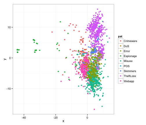
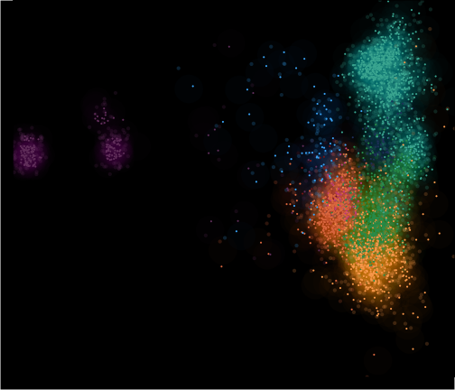
Well, that’s not exactly worthy of a cover shot is it? We want to give a feel of space and depth, so let’s create that by adjusting the transparancy (alpha) and size of the points. By setting a very low alpha, we can create some subtle sense of depth here. Since we’re putting the same x,y point on there a few times, let’s add some jitter to move things around slightly (within a 1x1 square). Let’s also put a black background on this and remove any and all labelling that we had above.
# because we use random jitter, let's set a seed for repeatability:
set.seed(1)
# Now let's create a ggplot instance, map color to the pattern text
gg <- ggplot(outdf, aes(x, y, color=pat))
# to make a "cloudy" effect, let's jitter on points with a large point
# and enable a lot of transparancy so these are subtle.
gg <- gg + geom_jitter(alpha=1/50, size=15, position = position_jitter(width = 1, height=1))
# now a smaller-large point with less transparancy, this really gives a
# nice "cloud" effect.
gg <- gg + geom_jitter(alpha=1/5, size=2, position = position_jitter(width = 2, height=2))
# and finally let's put a jitter on the points too, with no transparency
gg <- gg + geom_jitter(alpha=1, size=1, position = position_jitter(width = 1, height=1))
# set the color mapping
gg <- gg + scale_color_manual(values=outcols)
# remove axis padding, could set limits to zoom in or create more space
gg <- gg + scale_x_continuous(expand=c(0,0))
gg <- gg + scale_y_continuous(expand=c(0,0))
# now apply the theme from above.
gg <- gg + theme(axis.line = element_blank(),
                 panel.background = element_rect(fill="black"),
                 panel.margin =unit(c(0,0,0,0), "inches"),
                 panel.border = element_rect(fill=NA, color="black"),
                 panel.grid = element_blank(),
                 axis.title = element_blank(),
                 axis.ticks = element_blank(),
                 plot.margin =unit(c(0,0,0,0), "inches"),
                 plot.background=element_rect(fill="black"),
                 axis.text = element_blank(),
                 legend.position="none")
# finally view this.
print(gg)
That’s pretty cool, but we don’t really know what’s what and where things are without labels. So let’s aggregate the data to find the center point of clusters and add a label on there with the same color. Notice how unbelievably easy R makes that computation of cluster mean.
# Let's find the center of each pattern by taking the mean of x and y
labels <- aggregate(cbind(x, y) ~ pat, data=outdf, FUN=mean)
# now given the previous gg object, we can just append text labels
gg <- gg + geom_text(data=labels, aes(x=x, y=y, label=pat, color=pat), size=10)
# and print again.
print(gg)
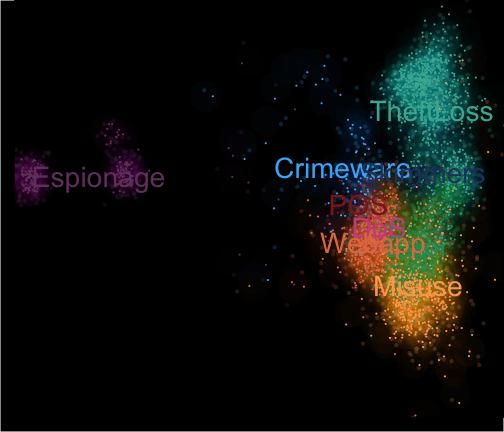
There we have it! Now that last image isn’t very pretty and the labels are relatively difficult to read, so I would have just use that last image as a reference and manually place the labels with an editor. But we can see the patterns pretty clearly here. And with a relatively small amount of code, we went from raw JSON in the VCDB to the style of MDS we used on the cover of the DBIR!
Tweet