
By Bob Rudis (@hrbrmstr)
Tue 08 April 2014
|
tags:
R,
visualization,
,
-- (permalink)
The US Government Accountability Office (GAO) released a report on April 2, 2014 titled “Federal Agencies Need to Enhance Responses to Data Breaches“. One of the extremely positive effects of Section 508 is that agencies must produce these type of reports in an accessible format (usually plain text) and I almost always start with those documents since it’s nigh impossible to come across a useless pie chart in those.
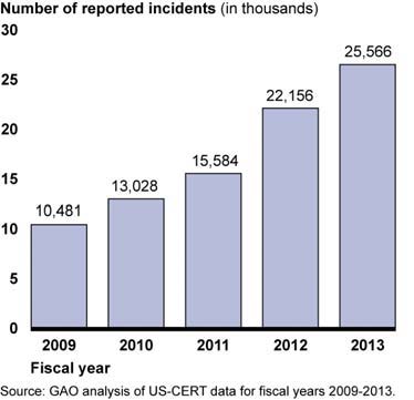
But, when I saw this data for the first figure:
Figure: Information Security Incidents Involving PII, Fiscal Years 2009–2013:

Fiscal year: 2009;
Number of reported incidents: 10,481.

Fiscal year: 2010;
Number of reported incidents: 13,028.

Fiscal year: 2011;
Number of reported incidents: 15,584.

Fiscal year: 2012;
Number of reported incidents: 22,156.

Fiscal year: 2013;
Number of reported incidents: 26,566.
I thought “oh, they led with a bar chart…the doc must be halfway decent”. So, I grabbed the PDF and flipped to Figure 1:
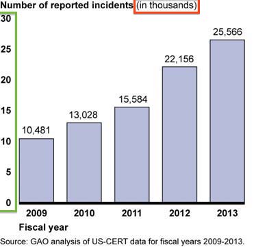
Well, I don’t know how it’s possbible, but the Feds managed to mess up a simple bar chart. The title says “in thousands” but the y-axis tick labels are just 2-digits, yet the labels on the bars are in the thousands:
The document has a few more like it (and, of course it has a pie chart).
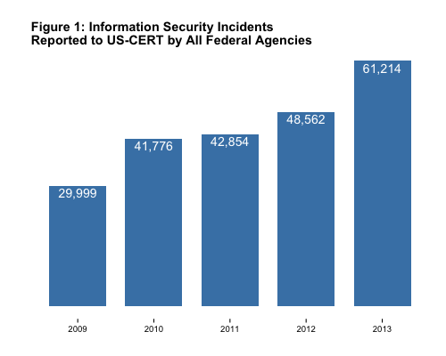
ZDNet posted an article where the mis-interpretation of the charts caused them to chide other news reports only to have them retract said chides (take a look at the overstrikes in their post). One of the examples they focused on was the total incident count:
Figure 1: Information Security Incidents Reported to US-CERT by All
Federal Agencies, Fiscal Years 2009-2013:

Fiscal year: 2009;
Number of reported incidents: 29,999.

Fiscal year: 2010;
Number of reported incidents: 41,776.

Fiscal year: 2011;
Number of reported incidents: 42,854.

Fiscal year: 2012;
Number of reported incidents: 48,562.

Fiscal year: 2013;
Number of reported incidents: 61,214.
The bar chart is equally as awry as the example above, so I won’t repeat it. Instead, let’s see how we can make some better visualizations from it and show how to do more detailed customizations with ggplot along the way.
First, we’ll make a proper version of the bar chart with the following R code:
# make a data frame for the values in the chart
incidents <- data.frame(year=c(2009,2010,2011,2012,2013),
                        count=c(29999,41776,42854,48562,61214))

# make the plot
gg <- ggplot(data=incidents, aes(x=year, y=count))
gg <- gg + geom_bar(stat="identity", fill="steelblue", width=0.75)
gg <- gg + geom_text(aes(label=prettyNum(count, big.mark=",")), vjust=1.25, color="white")
gg <- gg + labs(x="", y="", title="Figure 1: Information Security Incidents\nReported to US-CERT by All Federal Agencies")
gg <- gg + theme_bw()
gg <- gg + theme(plot.title=element_text(face="bold", hjust=0))
gg <- gg + theme(panel.border=element_blank())
gg <- gg + theme(panel.grid=element_blank())
gg <- gg + theme(axis.ticks.y=element_blank())
gg <- gg + theme(axis.text.y=element_blank())
gg <- gg + theme(panel.margin=unit(c(1,0,0,0), "picas"))
gg
We moved the title over to match the GAO style but ditched the Y axis ticks+labels and background ornamentation and labeled the bars with the actual values on the inside to maximize space. Specifying the various theme elements individually makes it really easy to keep a snippet library around to mix & match when you need to. Of course, if you use a fairly consistent set of theme parameters, you can always make your own theme and just use that.
Beyond Bars
While the actual number of incidents is necessary to convey, it might be more useful to focus on the rate of difference (increase or decrease) between years instead of the raw values. We can use the diff function in R to compute and use a dot+line plot to give us the utility & accuracy of bars with the aesthetics of dots and using on-chart labels vs axis ticks again.
# calculate the diffs
incidents$diff <- c(0,diff(incidents$count))
# setup where the labels will go
incidents$hjust <- c(0,-0.125,-0.125,-0.125,1.125)

# start with 2010 incidents since 2009 will be 0 diff from itself
gg <- ggplot(data=incidents[incidents$year>2009,], aes(x=year, y=diff))
gg <- gg + geom_segment(aes(xend=year, y=0, yend=diff), color="steelblue",
                                                        alpha=1/4)
gg <- gg + geom_point(aes(y=diff), size=3, color="steelblue",)
gg <- gg + geom_text(aes(y=diff, label=sprintf("%s diff\n[%s total]",
                                               prettyNum(diff, big.mark=","),
                                               prettyNum(count, big.mark=",")),
                         hjust=hjust), vjust=1, color="black", size=4)
gg <- gg + labs(x="\n(2009 start base == 29,999 incidents)", y="",
                title="YoY Breach Count Increase")
gg <- gg + theme_bw()
gg <- gg + theme(plot.title=element_text(face="bold", hjust=0))
gg <- gg + theme(panel.border=element_blank())
gg <- gg + theme(panel.grid=element_blank())
gg <- gg + theme(axis.ticks.y=element_blank())
gg <- gg + theme(axis.text.y=element_blank())
gg <- gg + theme(panel.margin=unit(c(1,0,1,0), "picas"))
gg
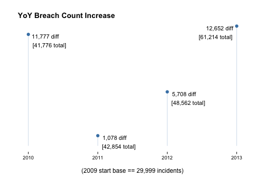
That chart should help show how much better (or worse) incident counts were between years and should also help the consumer ask new questions that the detail data (which it looks like we do not have in the GAO report) should be able to answer (like “which department/agency contributed to the yearly increases?”).
When reviewing/analyaing any US government report, make sure to find the more accessible version and even look for raw data on data.gov to ensure you’re getting the core of the message. And, don’t always rely on the visualizations presented to you by any report (industry, government, etc.). If you can get the data, make your own visualizations to ensure the message is not getting mangled in the medium.
Finally, take a look at the way the ggplot2 function parameters were formed for all these graphs. It’s possible to perform a significant amount of customization in-code to achieve a desired output effect, and this—in turn—makes it really straightforward to script production-ready output in R for repeated reports with little effort.