By Bob Rudis (@hrbrmstr)
Mon 11 May 2015
|
tags:
blog,
r,
rstats,
elasticsearch,
ipv4heatmap,
json,
-- (permalink)
Work has kept myself & @jayjacobs quite busy of late, but a small data set posted by @jw_sec this morning made for an opportunity for a quick blog post to show how to do some data maniupation and visualization in R for both security and non-security folk (hey, this may even get more non-security folk looking at security data which is a definite “win” if so). We sometimes aim a bit high in our posts and forget that many folks are really just starting to learn R. For those just getting started, here’s what’s in store for you:
- reading and processing JSON data
- using
dplyrand pipe idioms to do some data munging - using
ggplotfor basic data visualization - getting away from geography when looking at IPv4 addresses
All the code (and Jordan’s data) is up on github.
Reading in the data
Jordan made the honeypot logs available as a gzip’d JSON file. We’ll use GET from the httr package to read the data to disk to not waste Jordan’s bandwidth. We’ll save the data to disk via write_disk which will help it act like a cache (it won’t try to re-download the file if it exists locally, unless you specify that it should overwrite the file). I wrap it with try just to suppress the “error” message. Note that fromJSON reads gzip’d files just like it does straight JSON files.
source_url <- "https://jordan-wright.github.io/downloads/elastichoney_logs.json.gz"
resp <- try(GET(source_url, write_disk("data/elastichoney_logs.json.gz")), silent=TRUE)
elas <- fromJSON("data/elastichoney_logs.json.gz")
Cleaning up the data
You can view Jordan’s blog post to see the structure of the JSON file. It’s got some nested structures that we won’t be focusing on in this post and some that will cause dplyr some angst (some dplyr operations do not like data frames in data frames), so we’ll whittle it down a bit while we also:
- convert the timestamp text to an actual time format
- ensure the request method is uniform (all uppercase)
elas %>%
  select(major, os_name, name, form, source, os, timestamp=`@timestamp`, method,
         device, honeypot, type, minor, os_major, os_minor, patch) %>%
  mutate(timestamp=as.POSIXct(timestamp, format="%Y-%m-%dT%H:%M:%OS"),
         day=as.Date(timestamp),
         method=toupper(method)) -> elas
For those still new to the magrittr (or pipeR) piping idiom, the %>% notation is just a way of avoiding a bunch of nested function calls, which generally makes the code cleaner and helps (IMO) compartmentalize operations. Here we compartmentalize the “select” and “mutate” operations. Here is the resultant data frame:
glimpse(elas)
## Observations: 7808
## Variables:
## $ major     (chr) "2", "2", "6", "6", "6", "6", "6", "2", "6", "2", "2", "2", "2", "2", "2", "2", "2"...
## $ os_name   (chr) "Windows", "Windows", "Windows 2000", "Windows 2000", "Windows 2000", "Windows 2000...
## $ name      (chr) "Python Requests", "Python Requests", "IE", "IE", "IE", "IE", "IE", "Python Request...
## $ form      (chr) NA, NA, NA, NA, NA, NA, NA, NA, NA, NA, NA, NA, NA, NA, NA, NA, NA, NA, NA, NA, NA,...
## $ source    (chr) "58.220.3.207", "58.220.3.207", "115.234.254.53", "115.234.254.53", "115.234.254.53...
## $ os        (chr) "Windows", "Windows", "Windows 2000", "Windows 2000", "Windows 2000", "Windows 2000...
## $ timestamp (time) 2015-03-21 11:39:23, 2015-03-21 11:39:24, 2015-03-21 04:09:27, 2015-03-21 04:29:06...
## $ method    (chr) "GET", "GET", "GET", "GET", "GET", "GET", "GET", "GET", "POST", "GET", "GET", "GET"...
## $ device    (chr) "Other", "Other", "Other", "Other", "Other", "Other", "Other", "Other", "Other", "O...
## $ honeypot  (chr) "x.x.x.x", "x.x.x.x", "x.x.x.x", "x.x.x.x", "x.x.x.x", "x.x.x.x", "x.x.x.x", "x.x.x...
## $ type      (chr) "attack", "attack", "attack", "attack", "attack", "attack", "attack", "attack", "at...
## $ minor     (chr) "4", "4", "0", "0", "0", "0", "0", "4", "0", "4", "4", "4", "4", "4", "4", "4", "4"...
## $ os_major  (chr) NA, NA, NA, NA, NA, NA, NA, NA, NA, NA, NA, NA, NA, NA, NA, NA, NA, NA, NA, NA, NA,...
## $ os_minor  (chr) NA, NA, NA, NA, NA, NA, NA, NA, NA, NA, NA, NA, NA, NA, NA, NA, NA, NA, NA, NA, NA,...
## $ patch     (chr) NA, NA, NA, NA, NA, NA, NA, NA, NA, NA, NA, NA, NA, NA, NA, NA, NA, NA, NA, NA, NA,...
## $ day       (date) 2015-03-21, 2015-03-21, 2015-03-21, 2015-03-21, 2015-03-21, 2015-03-21, 2015-03-21...
You could also look at elas$headers and elas$geoip from the original structure we read in with fromJSON if you want to look a bit more at those. Unless you’re digging deeper or correlating with other data, we’re pretty much left with reporting “what happened” (i.e. basic counting), so let’s visualize a few of the fields.
Attacks vs Recons
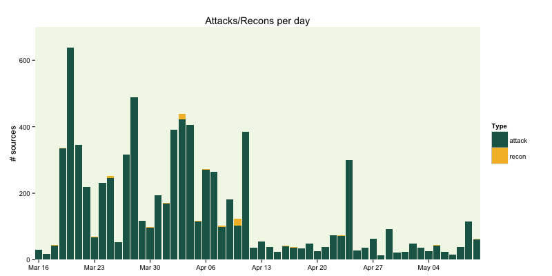
There is a type field in the JSON data which classifies the server contact as either an “attack” (attempt at actually doing something bad) vs “recon” (which I assume is just a test to see if the instance is vulnerable). We can see what the volume looks like per-day pretty easily:
gg <- ggplot(count(elas, day, type), aes(x=day, y=n, group=type))
gg <- gg + geom_bar(stat="identity", aes(fill=type), position="stack")
gg <- gg + scale_y_continuous(expand=c(0,0), limits=c(NA, 700))
gg <- gg + scale_x_date(expand=c(0,0))
gg <- gg + scale_fill_manual(name="Type", values=c("#1b6555", "#f3bc33"))
gg <- gg + labs(x=NULL, y="# sources", title="Attacks/Recons per day")
gg <- gg + theme_bw()
gg <- gg + theme(panel.background=element_rect(fill="#96c44722"))
gg <- gg + theme(panel.border=element_blank())
gg <- gg + theme(panel.grid=element_blank())
gg
Here we use dplyr‘s count function to count the number of contacts per day by type and then plot it with bars using some Elasticsearch corporate colors). Some of the less-obvious things to note are:
- the
stat="identity"ingeom_barmeans to just take the rawydata we gave the function (many of thegeom‘s inggplotare pretty smart and can apply various statistical operations as part of the layer rendering) position="stack"andfill=typewill give us a stacked bar chart colord bytype. I generally am not a fan of stacked bar charts but they make sense this timeexpand=c(0,0)reduces the whitespace in the graph, making the bars flush with the axes- using
limits=c(NA, 700)give us some breathing room at the top of the bar chart

There’s an interesting spike on April 24th, but we don’t have individual IDs for the honeypots (from what I can tell from the data), so we can’t see if any one was more targeted than another. We can see the top attackers. There are length(unique(elas$source)) == 236 total contact IP addresses in the data set, so let’s see how many were involved in the April 24th spike:
elas %>%
  filter(day==as.Date("2015-04-24")) %>%
  count(source) %>%
  arrange(desc(n))

## Source: local data frame [12 x 2]
##
##            source   n
## 1   218.4.169.146 144
## 2  61.176.222.160  70
## 3   218.4.169.148  36
## 4     58.42.32.27  24
## 5  121.79.133.179  10
## 6   111.74.239.77   6
## 7  61.160.213.180   4
## 8   107.160.23.56   2
## 9  183.129.153.66   1
## 10 202.109.189.49   1
## 11   219.235.4.22   1
## 12  61.176.223.77   1
218.4.169.146 was quite busy that day (missed previous days++ quota?). Again, we need more info to even try to discern “why”, something to think about when designing an information collection system for furhter analysis.
Contacts by request type
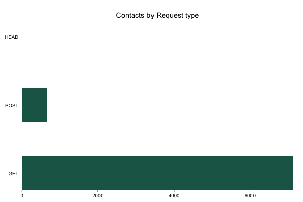
You can use the following basic structure to look at “contacts by…” for any column that makes sense. For now, we’ll just look at contacts by request type (mostly since that was an example in Jordan’s post).
gg <- ggplot(count(elas, method), aes(x=reorder(method, -n), y=n))
gg <- gg + geom_bar(stat="identity", fill="#1b6555", width=0.5)
gg <- gg + scale_x_discrete(expand=c(0,0))
gg <- gg + scale_y_continuous(expand=c(0,0))
gg <- gg + labs(x=NULL, y=NULL, title="Contacts by Request type")
gg <- gg + coord_flip()
gg <- gg + theme_bw()
gg <- gg + theme(panel.background=element_blank())
gg <- gg + theme(panel.border=element_blank())
gg <- gg + theme(panel.grid=element_blank())
gg <- gg + theme(axis.ticks.y=element_blank())
gg

Top IPs
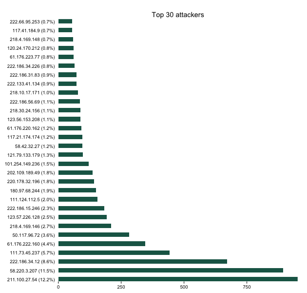
We can also see who (overall) were the noisiest contacts. This could be useful for reputation analysis but I’m doing it mainly to show some additional dplyr and ggplot work. We’ll count the sources, make a pretty label for them (with % of total) and then plot it.
elas %>%
  count(source) %>%
  mutate(pct=percent(n/nrow(elas))) %>%
  arrange(desc(n)) %>%
  head(30) %>%
  mutate(source=sprintf("%s (%s)", source, pct)) -> attack_src

gg <- ggplot(attack_src, aes(x=reorder(source, -n), y=n))
gg <- gg + geom_bar(stat="identity", fill="#1b6555", width=0.5)
gg <- gg + scale_x_discrete(expand=c(0,0))
gg <- gg + scale_y_continuous(expand=c(0,0))
gg <- gg + labs(x=NULL, y=NULL, title="Top 30 attackers")
gg <- gg + coord_flip()
gg <- gg + theme_bw()
gg <- gg + theme(panel.background=element_blank())
gg <- gg + theme(panel.border=element_blank())
gg <- gg + theme(panel.grid=element_blank())
gg <- gg + theme(axis.ticks.y=element_blank())
gg

Better than geography
There’s the standard “geoip” blathering in the data set and a map in the blog post (and, no doubt, on the Kibana dashboard). Attribution issues aside, we can do better than a traditional map. Let’s dust off our ipv4heatmap package and over lay China CIDRs on a Hilbert space IPv4 map. We can grab China CIDRs from data sets maintained by Ivan Erben. I left this a traditional straight readLines call, but it would be a good exercise for the reader to convert this to the httr/write_disk idiom from above to save them some bandwidth.
hm <- ipv4heatmap(elas$source)

china <- grep("^#", readLines("https://www.iwik.org/ipcountry/CN.cidr"), invert=TRUE, value=TRUE)
cidrs <- rbindlist(pbsapply(china, boundingBoxFromCIDR))

hm$gg +
 geom_rect(data=cidrs,
           aes(xmin=xmin, ymin=ymin, xmax=xmax, ymax=ymax),
           fill="white", alpha=0.1)
(Touch/click the graphic for a larger, zoomable version)
China IP space is a major player, but the address blocks are not at all mostly contiguous and there definitely are other network (and geo) sources. You can use dplyr and the other CIDR blocks from Ivan to take a more detailed look.
Wrapping up
There are definitely some further areas to explore in the data set, and I hope this insipred some folks to fire up RStudio and explore the data a bit further. If you find anything interesing, drop a note in the comments. Remember, all the source for the above is on github.
Tweet
