By Jay Jacobs (@jayjacobs)
Mon 15 September 2014
|
tags:
blog,
r,
rstats,
-- (permalink)
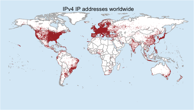
During July I was working with a commercial data source that provides extra data around IP addresses and it dawned on me: rather than pinging billions of IP addresses and creating map, I could create a map from all the geolocation data I had at my finger tips. At a high level I could answer “Where are all the IPv4 addresses worldwide?” But in reality what I created was a map communicating “Where does the geo-location services think all the IPv4 address are worldwide?” And at the end of July I put together a plot in about an hour and tossed it onto twitter. It is still getting retweets over a month later in spite of the redundancy in the title.

Bob and I have talked quite a bit before about the (questionable) value of maps and how they can be eye-catching, but they often lack the substance to communicate a clear message. The problem may be compounded when IP geolocation is the data source for maps. Hopefully I can point out some of the issues in this post as we walk through how to gather and map every IPv4 address in the world.
Step 2: Get the data
I already did step 1 by defining our goal and as a question it is,
“Where does the geo-location service think all the ipv4 addresses are
worldwide?” Step 2 then is getting data to support our research. When I
created the original map I used data from a commercial geolocation
service. Since most readers won’t have a subscription, we can reference
Maxmind and their free geolocation
data. Start by
downloading the “GeoLite City” database in
CSV/zip
format (28meg download) and unzip it to get the
“GeoLiteCity-Location.csv” file. Since the first line of the CSV is a
copyright statement, you have to read it in and skip 1 line. Because
this is quite a bit file, you should leverage the data.table command
fread()
library(data.table)
geo <- fread("data/GeoLiteCity-Location.csv", header=T, skip=1)
# how many rows?
geoRows <- nrow(geo)
print(geoRows)

## [1] 557986
Right away here, you can see some challenges with IP geolocation. There are around 4.2 billion total IP address, 3.7 billion are routable (half a billion are reserved) and yet the data only has a total of 557,986 unique rows. It’s probably a safe bet to say some of these may be aggregated together.
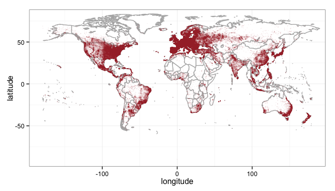
You can jump right to a map here and plot the latitude/longitude in that file, but to save processing time, you can remove duplicate points with the unique function. Then load up a world map, and plot the points on it.
geomap1 <- unique(geo, by=c("latitude", "longitude"))

library(maps)
library(ggplot2)

# load the world
world_map<-map_data("world")
# strip off antartica for aesthetics
world_map <- subset(world_map, region != "Antarctica") # sorry penguins
# set up the plot with the map data
gg <- ggplot(world_map)
# now add a map layer
gg <- gg + geom_map(dat=world_map, map = world_map,
                    aes(map_id=region), fill="white", color="gray70")
# and the ip geolocation points
gg <- gg + geom_point(data=geomap1, aes(longitude, latitude),
                      colour="#AA3333", alpha=1/10, size=0.5)
# basic theme
gg <- gg + theme_bw()
# show the map
print(gg)

That’s interesting, and if you notice the alpha on the points is set to 1/10th, meaning it will take ten point on top of one another to make the color solid (red in this case). One thing we didn’t do though is account for the density of the IP addresses. Some of those points may have thousands while others may have just a handful and the map doesn’t show that. In order to account for that you have to load up the other file in the zip file, the GeoLiteCity-Blocks file and merge it with the first file loaded.
blocks <- fread("data/GeoLiteCity-Blocks.csv", header=T, skip=1)

# these columns are read is as character for some reason
# make them numeric
blocks <- blocks[, lapply(.SD, as.numeric)]
fullgeo <- merge(blocks, geo, all=TRUE, by="locId") # "all" is important here
# trim out the columns we need
fullgeo <- fullgeo[ ,c(2,3,8,9), with=FALSE]
# set column names that are easier to type
setnames(fullgeo, c("begin", "end", "latitude", "longitude"))
# look at the data
print(fullgeo)

##              begin       end latitude longitude
##       1:        NA        NA     0.00     0.000
##       2: 2.655e+08 2.655e+08    35.00   105.000
##       3: 2.655e+08 2.655e+08    35.00   105.000
##       4: 5.408e+08 5.408e+08    35.00   105.000
##       5: 5.870e+08 5.870e+08    35.00   105.000
##      ---
## 2428090: 3.646e+09 3.646e+09    52.52    13.400
## 2428091: 3.647e+09 3.647e+09    52.88     9.683
## 2428092: 3.735e+09 3.735e+09   -39.93   175.050
## 2428093: 3.735e+09 3.735e+09   -41.30   174.783
## 2428094: 3.730e+09 3.730e+09    24.67   118.458
What you are looking at here is four columns, the begining and ending
address in an IP block with the latitude and longitude of that block.
The IP addresses are stored in long format, which is both easier to work
with and smaller for memory/storage of the data. We’ll make use of the
long format in a bit, for now we still have more clean up to do. Notice
the first line where begin and end are both NA? That either means
there were empty values in the CSV or the merge command didn’t have a
matching record for that location ID and because you set all to true
in the merge command above, it filled in the row with NA’s. The default
behavior is to drop any rows that aren’t in both tables, but we overrode
that by setting all=TRUE. We could take care of these NA’s but
removing the all from the merge command and accept the default of
FALSE for all. But this is interesting, because in our first plot we
just took all the latitude and longitude and plotted them… how many
don’t have corresponding IP address blocks?
sum(is.na(fullgeo$begin))

## [1] 430051
430 thousand orphaned locations? That seems like a lot of unassociated lat/long pairs, doesn’t it?
But keep going, you’ll want to do two more things with this data: 1)
count the number of IP’s in each block and 2) total up the number of
IP’s for each location. In order to do that efficiently from both a code
and time perspective we’ll leverage dplyr. Let’s clean up the NA’s
while we are at it.
library(dplyr)

# tbl_dt loads a data.table object into dplyr
# and the %>% is the "pipe" command to send the output
# to the next command.
finalgeo <- tbl_dt(fullgeo) %>%
  filter(!is.na(begin)) %>%  # remove the NA's.
  mutate(count = end - begin + 1) %>% # count the # of IPs
  group_by(latitude, longitude) %>% # aggregate by unique lat and long
  summarise(ipcount=sum(count)) # add up all counts
# what do we have?
print(finalgeo)

## Source: local data table [105,304 x 3]
## Groups: latitude
##
##    latitude longitude ipcount
## 1    -90.00      0.00    4419
## 2    -54.80    -68.30    6560
## 3    -54.16    -36.72       5
## 4    -53.87    -67.78    1280
## 5    -53.79    -67.71    8960
## 6    -53.67    -68.47       8
## 7    -53.33    -68.95      24
## 8    -53.15    -70.92    6152
## 9    -51.75    -59.00    1154
## 10   -51.73    -72.52     256
## ..      ...       ...     ...
Notice how we have 105,304 rows? That’s a far cry from the 557,986 rows we had in the original latitude/longitude pairings you mapped.
Explore the data
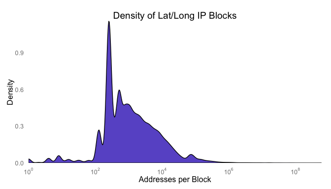
What does the distribution of the counts look like? Chances are good there is a heavy skew to the data. To create a plot where you can see the distribution, you’ll have to change the axis showing the distribution of addresses per lat/long pair to a logorithmic scale.
library(scales)
gg <- ggplot(finalgeo, aes(x=ipcount))
gg <- gg + geom_density(fill="slateblue")
gg <- gg + scale_x_log10("Addresses per Block", expand=c(0,0),
                         breaks = trans_breaks("log10", function(x) 10^x),
                         labels = trans_format("log10", math_format(10^.x)))
gg <- gg + scale_y_continuous("Density", expand=c(0,0))
gg <- gg + ggtitle("Density of Lat/Long IP Blocks")
gg <- gg + theme(axis.ticks=element_blank(),
                 panel.grid=element_blank(),
                 panel.background=element_rect(color=NA,
                                               fill=NA))
print(gg)

I would guess that the spikes are around and we can check by converting
the count field to a factor and running summary against it.
summary(factor(finalgeo$ipcount), maxsum=10)

##     256     512     128     768    1024     384    1280     640    1536
##   21905    8744    5142    4583    3543    3019    2154    1936    1545
## (Other)
##   52733
While that’s interesting, it’s not surprising or all that informative.
Back to the map, right now you have three variables, the latitude, longitude and count of addreses at the location. Lat and long are easy enough, those are points on a map. How do represent density at that point? I think there are three viable options: color (hue), size or opacity (color brightness). In my original plot, I leverage the alpha setting on the points. Trying to use hue would just get jumbled together since at the world view many of the points overlap and individual colors would be impossible to see. with a hundred thousand+ points, size also will overlap and be indistinguishable.
Since all we want to see is the relative density over the entire map, the reader won’t care if there is a lot of IP addresses at a point or a whole lot of IP addresses at point. Showing density is what’s important, so let’s use the alpha (opacity) setting of the point to show density. The alpha setting is a value between 0 and 1, and our counts are large numbers with a heavy skew. To wrangle the range into an alpha setting we should first take the log of the count and then scale it between 0 and 1. I chose to apply log twice to shift the skew the distribution so most of the values are less than 0.5. Since the points overlap, this should make a nice range of opacity for the points.
temp <- log(log(finalgeo$ipcount+1)+1)
finalgeo$alpha <- (max(temp)-temp)/max(temp)
hist(finalgeo$alpha)

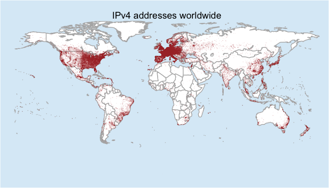
And now let’s map those!
world_map<-map_data("world")
world_map <- subset(world_map, region != "Antarctica") # inteRcouRse AntaRctica
gg <- ggplot(world_map)
gg <- gg + geom_map(dat=world_map, map = world_map,
                    aes(map_id=region), fill="white", color="gray70")
gg <- gg + geom_point(data=finalgeo, aes(longitude, latitude),
                      colour="#AA3333", alpha=finalgeo$alpha, size=0.3)
gg <- gg + scale_x_continuous(expand=c(0,0))
gg <- gg + scale_y_continuous(expand=c(0,0))
gg <- gg + expand_limits(x = world_map$long, y = world_map$lat)
gg <- gg + ggtitle("IPv4 addresses worldwide")
gg <- gg + theme(axis.text=element_blank(),
                 axis.title=element_blank(),
                 legend.position="none",
                 axis.ticks=element_blank(),
                 panel.grid=element_blank(),
                 panel.background=element_rect(color=NA,
                                               fill=NA),
                 plot.background=element_rect(fill="#A0CFEC66"))
gg

And there you have it! There are several tweaks that could be done to this. If you notice in this final map, I set the point size to be 0.3. If you raise that up you can create a map that is very dense with color and the size of the point is relative to the size of the output plot. If you export at 4x6 a point size of 0.3 may be huge, but they may barely show up if you export at 15x20. There is no set formula and you can play around with the values, but just be sure the final product stays as close to the data as possible.
A Final Thought
We talked about the “Potwin effect” in our book and Bob mentioned it in his Statebins blog post as well. But if you notice some of the lat/long pairs are rounded off to whole integers. That may be a good indication that the only thing known about the geolocation of the IP address is the country. Further work may be to remove or otherwise account for the uncertain points by matching. Chances are good they are the only lat/long pairs that are both whole numbers throughout the data.
Tweet