By Jay Jacobs (@jayjacobs)
Thu 11 December 2014
|
tags:
blog,
r,
rstats,
-- (permalink)
I was recently presenting on the use of statistics for risk analysis at the SIRACon conference held in Minneapolos (Oct. 9th and 10th, 2014). I was explaining how models and algorithms work at a high level: given one or more observations and the outcomes, we build models or algorithms to learn how the observations can help predict the outcome. As examples I used things like CVSS, the Binary Risk Assessment and the Ponemon cost of data breach (CODB) report. All of them use observables that feed into some type of model for the purpose of predicting an outcome (or providing a score). In the case of Ponemon, I simplified the model down to having an observable of # of records, the model is to multiply that by a fixed number and the output (prediction) is the impact of a breach.
I got feedback after this presentation that my “characterization of Ponemon’s approach to deriving the cost of a record is neither fair nor accurate.” After a few emails back and forth on the topic, I learned that the data was published and available for review. Using the data provided by the Ponemon Institute, I have concluded that my portrayal of Ponemon’s model as simple was both accurate and entirely fair. And in this analysis I will not only show that the approach used by Ponemon is not just overly simple, but also misleading and even may be harmful to organizations using the Ponemon research in their risk analyses. All of which brings me to an obvious conclusion that using just the number of records lost in a breach is not an accurate indiciation of impact from that breach.
The Data
The data I have is from both the 2013 and 2014 Cost of Data Breach (CODB) report. I was forwarded a version of these reports that have the data. As I search around the Internet, I struggle to find the versions with the data in the back. I used software to extract the figures from the PDF versions. The data is only drawn from United States companies.
Finally, I make no statements about how the data was collected. This analysis makes the assumption, as the CODB reports do, that the data collection method is not seriously flawed. This focuses on the insight we can gain by analyzing the data itself.
Visualizing the Data
Typically when comparing two values like this (number of records compromised and the impact) the first and perhaps most important step is to visualize the data. Yet at no point in the CODB reports is such a visual created. When trying to understnd this data, just seeing a simple scatter plot with the number of records lost on the x-axis and the amount of money lost on the y-axis and a dot for each reported breach is invaluable. So, let’s do that first.
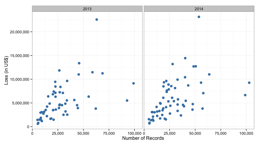
For each of the two years, the data starts in the lower left (low number of records and losses) and expands up to the right. It also looks like as the breach gets bigger in either cost or number of records, the data fans out and spreads. That fanning may pose a challenge to a simple linear model (and it does as noted below). But it’s nice to see the data laid out like this.
How good is the Ponemon model?
Before we look at how good the model is, let’s look at how the model is derived. The 2013 CODB states, “the average per capita cost of data breach declined from $194 to $188”, (“per capita cost of data breach” is the same as “cost per compromised record”). The 2014 report shows in Figure 2 that the U.S. cost per compromised record going from $188 in 2013 to $201 in 2014. So in 2013 the cost of a data breach was $188 per record and it was $201 in 2014. Where are these coming from? They simply total up the losses for the year and divide that by the total records lost in that year. Using their data we can confirm this:
##   year    losses records perRecord
## 1 2013 291796753 1553335     187.9
## 2 2014 356965434 1774335     201.2
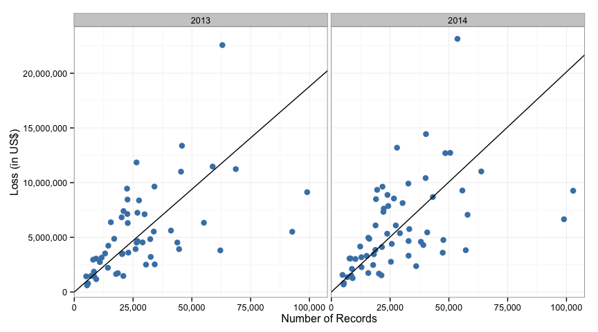
This model has an advantage in its simplicity. The end user can simply multiply the number of records in their system by a fixed dollar figure and get an estimate of loss. But as we’ll see, this is a very poor model at describing this data and is quite misleading to the reader. In order to quantify how the model performs in describing the data we will calculate what’s known as the R-Squared value, which will give some indication of how well the model “fits” the data. The result will be between 0 and 1 with 1 representing a perfect fit of the data.
- For 2013, at $188 per record, the r-squared value is 0.1293
- For 2014, at $201 per record, the r-squared value is 0.0223
This means that the Ponemon model describes about 13% of the variation in the data in 2013 and just over 2% of the variation in 2014.
As a point of reference, think of how well you could estimate a persons weight if you only knew their height. Using this data, we can calculate the r-squared to be 0.2529 if we use a simple linear regression model. Meaning, if we just use height we can describe 25% of the variance in people’s weight. Compare that against the r-squared value from the Ponemon model.
We can visualize the relationship in the Ponemon model by adding in a line for the estimated values on the same graphs we made before.
Alternative 1: Simple Linear Regression
Since we have the data, we can explore the relationship between the number of records and the reported losses. Let’s start with a simple linear regression model where we use the number of records as the independant variable and the total loss in dollars as the dependant variable. Here is the output from the model for 2013 data.
##
## Call:
## lm(formula = total ~ records, data = y3)
##
## Residuals:
##      Min       1Q   Median       3Q      Max
## -6725789 -2085298  -828787  1930669 13515451
##
## Coefficients:
##             Estimate Std. Error t value Pr(>|t|)
## (Intercept) 2.33e+06   7.87e+05    2.96   0.0046 **
## records     1.07e+02   2.23e+01    4.78  1.5e-05 ***
## ---
## Signif. codes:  0 '***' 0.001 '**' 0.01 '*' 0.05 '.' 0.1 ' ' 1
##
## Residual standard error: 3330000 on 52 degrees of freedom
## Multiple R-squared:  0.306,  Adjusted R-squared:  0.292
## F-statistic: 22.9 on 1 and 52 DF,  p-value: 1.46e-05
There is a lot going on in this output. First the model estimated by the linear regression is:
<Losses> = 2,330,000 + $107*<Records>
Which can be interpretted as, “Each breach has an average static loss of $2.3 million plus an additional $107 of loss for each record compromised.” I added emphasis to the rather important part of that statement. This regression model estimates the cost for each additional record to be $107, not the $188 estimated by the Ponemon model. Also, if you notice the (adjusted) R-squared value, it’s now up to 29%. Still a rather low value, but certainly better than 13%. The only other thing to notice about the model is the variable of the number of records is significant (p-value of 0.00001) and the overall model is significant with a similar tiny p-value.
And 2014:
##
## Call:
## lm(formula = total ~ records, data = y4)
##
## Residuals:
##      Min       1Q   Median       3Q      Max
## -6383308 -2228903  -938958  2154815 14767865
##
## Coefficients:
##             Estimate Std. Error t value Pr(>|t|)
## (Intercept) 2.86e+06   8.08e+05    3.54  0.00079 ***
## records     1.03e+02   2.29e+01    4.48  3.4e-05 ***
## ---
## Signif. codes:  0 '***' 0.001 '**' 0.01 '*' 0.05 '.' 0.1 ' ' 1
##
## Residual standard error: 3570000 on 59 degrees of freedom
## Multiple R-squared:  0.254,  Adjusted R-squared:  0.242
## F-statistic: 20.1 on 1 and 59 DF,  p-value: 3.43e-05
This model is:
<Losses> = 2,862,000 + $103*<Records>
If we wanted to put meaning to this (which we shouldn’t as we’ll see next), we could say that the static costs increased in 2014 while the cost per record actually decreased in 2014. This is opposite of what is claimed in the 2014 Ponemon CODB report. Also note, the R-Squared value here is 24% or so and an improved over the Ponemon R-squared value of 2% for 2014.
We can visualize the differences between the Ponemon method and a linear regression (the new red lines represent the linear regression):
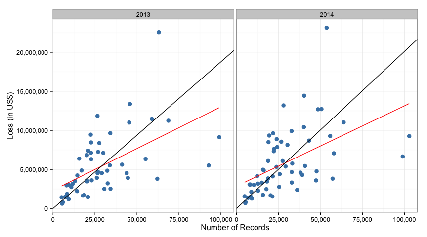
Note that as the number of records increases toward 100,000, the ponemon model is grossly overstating the loss compared to the linear regression model.
Is the difference between 2013 and 2014 significant?
We can test if there is a significant difference between the two years with the linear regression model. If we cannot show significant difference, than we cannot say that the cost per record increased or decreased from 2013 to 2014.
When we test the significance we get a p-value of 0.5208, meaning we cannot claim any statistical difference between the 2013 and 2014 data. Therefore, any changes we see from 2013 to 2014 data could easily just be a factor of natural fluctuations in the data.
And the linear model is inadequate.
Since the data across the years isn’t significantly different, I will combine them and look at a diagnostic plot for the linear regression, specifically the residuals plot.
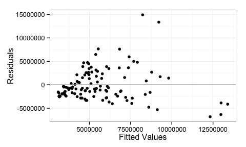
This plot is indicating heteroskedasticity in the data. The plot shows that as the fitted values increases the variation increases (we get a cone or fan shape here). This means that a simple linear model may not be the best choice to describe this data and we will want to try something that can account for the uneven variation.
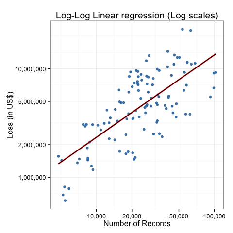
Alternative 2: Log-Log Regression
After some trial and error, I found a fairly good model to describe the
data, but it’s at the expense of simplicity. If we take the log() of
both the impact and loss prior to modeling and add in a polynomial value
as well, we get just about as good of a fit as we will get from this data.
##
## Call:
## lm(formula = log(total) ~ log(records), data = ponemon)
##
## Residuals:
##     Min      1Q  Median      3Q     Max
## -1.0243 -0.3792  0.0204  0.4197  1.0188
##
## Coefficients:
##              Estimate Std. Error t value Pr(>|t|)
## (Intercept)    7.6800     0.7013    10.9   <2e-16 ***
## log(records)   0.7584     0.0697    10.9   <2e-16 ***
## ---
## Signif. codes:  0 '***' 0.001 '**' 0.01 '*' 0.05 '.' 0.1 ' ' 1
##
## Residual standard error: 0.523 on 113 degrees of freedom
## Multiple R-squared:  0.512,  Adjusted R-squared:  0.508
## F-statistic:  119 on 1 and 113 DF,  p-value: <2e-16
Notice the R-squared is now around 50%, which still isn’t great, but it’s certainly an improvement over the other two models.
This model is:
log(impact) = 7.68 + 0.76*log(records)
Which looks complicated, but it’s simple enough to be run on scientific calculator, or in our case, Google. For example, This is the calculation#q=exp(7.6799625+%2B+0.7583576*ln(25000))) that estimates the losses for a breach with 25,000 compromised records.
We can also visualize this model:
Simplifying the differences
We can create a much more intuitive measurement for how accurate these models are. Since we have data that includes the number of records and the associated (real) loss amount, we can compare the estimated (calculated) loss amount from each of the three models to reality and see how far off each model is across all observations.
For example, one event in 2013 lost 32,311 records and reported a loss of $3,747,000. Using the Ponemon model estimates $6,074,468, my first model estimated $5,995,159 and the second model estimated $5,689,385. If we simply add up the absolute differences across all the observations for each of the models, we can get a feel for their accuracy.
| Model | Model | Abs. Diff | Avg. Difference |
|---|---|---|---|
| Ponemon | impact = 188 * records (201 in 2014) |
$309,307,668 | $2,689,632 |
| Basic LM | impact = 2608239 + 105 * records |
$295,513,436 | $2,569,682 |
| Log-Log LM | impact=exp(7.68+0.76*ln(records)) |
$277,306,083 | $2,411,357 |
And this is across 115 observations from 2013 and 2014, meaning the average estimate for each of these is off the mark by $2 million over 2 years.
In Summary:
Even though none of the models presented here performed particularly well with this data, we were able to improve on the simplistic method employed by Ponemon. But even with the improved results, it is painfully clear that there are a lot more factors contributing to loss than just a count of records lost. As George Box famously said, “All models are wrong, but some are useful.” After looking at this data, I would caution anyone using these models to take them all with a grain of salt. While using something like the log-log model above may be able to provide a frame of reference where there is currently a lot of uncertainty, the amount of variance in the model is a serious challenge to adoption.
Tweet